
Client: Spotify | Role: UX/UI Designer | Duration: 4 weeks | Tools: Figma, Google Forms
Overview
Spotify is a music streaming and media service provider. As the leader in the industry, it wants to remain on top by focusing on improving engagement and increasing retention in the app. In order to do that, they want to expand on their social capabilities.
Challenge
It is undeniable that music plays a pivotal role in connecting people together through various sorts of interactions. Spotify wants to make a move to enhance that connection. And not just with one-to-one interactions but with group settings as well. Any new social capability should revolve around human emotional connection derived from music. So what are ways to further connect people through music?
My Process
The process below outlines my approach for this project. I chose to conduct a survey as a quick and efficient way of validating my secondary research. Since this was a new feature for an existing app, I didn’t need to create or recreate the branding. However, it was important to be familiar with it to make sure I implemented the feature seamlessly within Spotify’s platform.
Goal
Design a new social feature that integrates seamlessly within the rest of the Spotify app.
1. Research
It was key to identify the trends and opportunities within the research phase. Based on the popularity of video streaming and sharing, it made sense to build a feature that would incorporate these two things with music. And with the addition of augmented reality, it would influence more people to connect with each other.
Secondary Research
I started out by conducting research on Spotify and the music streaming industry. I then looked at its competitors and identified trends and potential opportunities for the company to further develop the music listening experience.
From this research I was able to come up with an idea to create a new feature that would incorporate video, music and advanced technology together.
Survey
To further back up my secondary research with quantitative data, I decided to conduct primary research through the use of a survey. I surveyed 12 participants who use music streaming apps. The questions focused on participants’ preferences on video content and music streaming. In addition, it asked participants for their thoughts on integrating the both of them together.
The results would prove and help me move forward with my idea of what would eventually be a music video creator feature for Spotify.
2. Define
To further understand my research I created a persona that represents Spotify’s target base. I then came up with additional features similar to that of popular video creator apps to give users a sense of familiarity. In order for a smooth integration, the flow of creating the music video mimicked the flow of creating a music playlist on Spotify.
Persona
With the research I gathered, I was then able to come up with a persona that would help guide me through my design decisions. Please meet Piper Bell! She represents the millennial population that dominates Spotify’s user base.
Feature Roadmap
Knowing Piper’s goals and frustrations, I was able to think of the features that would help solve her problems. This would lay out the groundwork for what I would eventually need to design.
App Map
Next I needed to see where I can include this new feature within Spotify’s platform. Therefore I created an app map of the current structure of the Spotify app. From there I was able to see where the best place the music video creator can be added and still be consistent with the rest of the app.
Task Flow
From there, I came up with the task for Piper to create a 60 second artist music video. This defined the path the user would need to take and helped me outline the different screens I needed to design.
User Flow
To further develop the design screens I had in mine, I needed to test out the flow of this feature by adding in decision points with a user flow. This would ensure that the feature would run smoothly and be intuitive for the user. One point that was new and different from creating a music playlist was deciding whether to take a self picture or add a photo from the phone to use in the video.
3. Design
Using my app map, I was able to picture where the music video creator would be embedded within Spotify. My sketches and wireframes allowed me to see where I can incorporate all of the necessary options of the feature. Using Spotify’s branding I created a UI kit that helped me design my high-fidelity UI screens.
Sketches
Then it was time to start designing what the screens would look like. Being consistent with Spotify’s current style was top priority. I looked at their current design patterns to help me recreate some of the app’s screens. I wanted to make sure that the functionality of the new feature was simple and familiar with users. Therefore I looked at other popular apps such as Instagram & REFACE (face swapping videos) as inspiration in designing the music video creator.
Wireframes
I then developed my sketches into digital wireframes. This allowed me to consider the sizing of each element which would allow me to add more options to the feature that would enhance the experience.
High-Fidelity UI Designs
To complete my high-fidelity UI screens, I referenced Spotify’s style guide in order integrate the music video creator within the app. I wanted the user to be able to search for a music video, choose the desired part of the video, input their face, add effects and be able to share it across multiple social platforms.
UI Kit
After completing my UI designs, I put together a UI kit with all the elements that were used. This was to ensure consistency if I needed to create additional screens when building out a prototype for usability testing.
4. Test
With my high-fidelity UI screens, I built a prototype using Figma. This would set me up to perform usability testing in order to see if the users can go through the process of creating a personalized music video without any errors. I received good feedback with a few suggestions.
Prototype
I developed a prototype to test out the new feature with users so I can receive feedback. My focus was to simulate the same navigation transitions between screens like in Spotify’s mobile app. Click below to see.
Usability Testing
Usability testing was conducted with four millennials who have used the Spotify app. The testing had participants complete the following task:
Create an face swap artist music video
Affinity Map
After testing the prototype I sorted the results in an affinity map so I can identify areas for improvement. Overall, the participants liked the feature and thought the functionality was simple with one user saying, “This feature really elevates the experience of Spotify.”
Suggestions:
One common suggestion among the participants was to inform the user of the new feature with a description/explanation somewhere in the app
Participants suggested informing the user on the homepage or on a landing page when the user logs into the app
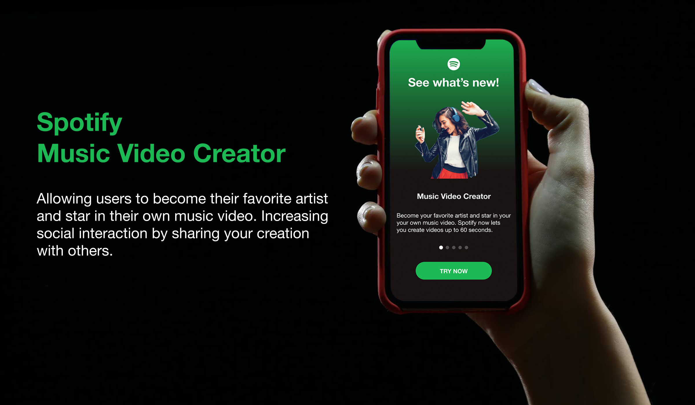
Revisions
Based on the feedback I decided to design landing screens to inform the user of what the music video creator is and how it works. These screens are shown below along with the final prototype.
Next Steps
The next steps would be to build on the social interactions within this feature. I would add the ability to like and comment on a video. In addition, I would build on the visual effects and incorporate the option to change the speed of the video. I would also add the ability to reverse and repeat sections of the music video.
Final Takeaways
This project was different for me in that there were constraints to work with since the aim was to create a new feature for an already existing app. However, I still thoroughly enjoyed it. It gave me a chance to take a different approach in the design process. It was a good experience for me since most projects for UX designers would be to create something for an existing product. This gave me the ability to adapt as a designer by working with what I was given and still be able to bring my idea to life with a feature that was innovative and addressed the needs of the users.